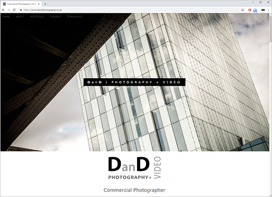
Screenshot of new landing page. Full ‘responsive’ design that works on any screen size

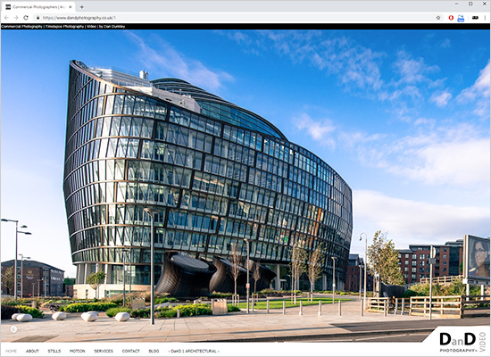
Screenshot of new main site home page, now all in HTML 5
After launching my shiny new dedicated architectural photography website a few months ago, my original main site started looking at me with doe eyes. Although I still like(d) it, it’s not had a refresh for at least 5 years, so it was overdue really.
A website re-design is always way more work than you think it’s going to be. Not a huge amount has changed in terms of main content and images, but the back end, front end and general design have all had an overhaul. A big move is that for the main body of the site I’ve finally ditched Flash. As someone who worked in web design (a looong time ago, when it was fun) I’ve always liked Flash from a ‘designy’ look and feel perspective. But, from an SEO and usability point of view it’s not the best, so it finally had to go and HTML5 is now in its place. Although still full screen image driven, to best show off my still photography, the main body of the site now has a more white and whitespacey design for text content and the navigation bar, which has also shifted to the bottom.
The biggest change is the completely re-worked and re-designed front end or main ‘landing page’ at https://www.dandphotography.co.uk. This is now a ‘responsive’ design that fits to any screen size on any device, and is content driven (hopefully) providing a good summary of what DanD Photography + Video is all about.
> Head on over to https://www.dandphotography.co.uk for a look.


